
Maps show - and hide - key information about Ukraine war
THE CONVERSATION
“All maps are lies,” my colleague, geographer David Salisbury, says.
He’s right. All maps are inherently incomplete, focusing on certain subjects and areas to the exclusion of others. These are crucial aspects of rhetoric, the field I study. Every map distorts the world, whether it’s of a local area or the whole Earth. No map can do otherwise, except a map exactly as large as the territory it depicts – though as the author Jorge Luis Borges famously pointed out, that map would be useless.
But maps’ lies can be productive. Maps can simplify the world and make it more easily comprehensible.
Geographers often speak in terms of what they call the “silences” of maps – what’s missing and unseen, hidden in the margins. Those silences are just as meaningful as what’s on the page. It’s important to ask what has been left out.
That’s certainly true when looking at maps depicting aspects of Russia’s war on Ukraine. News organizations around the world have published many maps of the crisis, but their standard views are not the only way maps can help people understand what is happening in Ukraine.
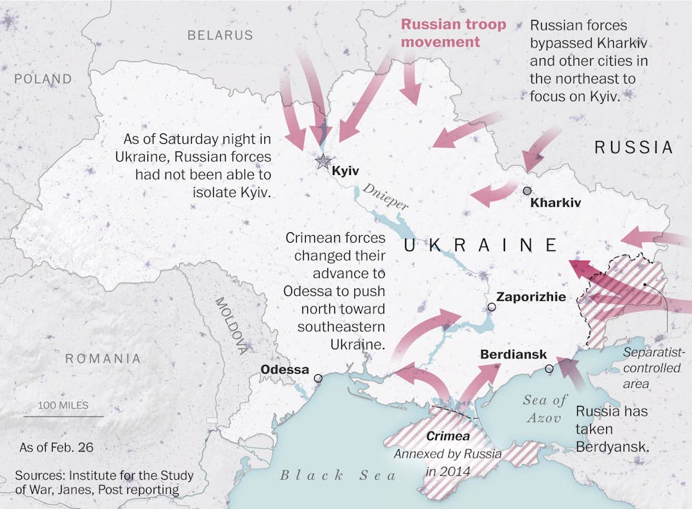

Maps like this one from The Washington Post can signal an inevitability of Russian advancement and make a chaotic conflict seem orderly and organized. Washington Post
Surrounded
Most typical news maps show Ukraine as an encircled and embattled nation.
Even without other markings, Ukraine appears small, with Russia looming over it from the north and east. Once annotated with arrows showing the general directions of invasion forces, icons showing specific attacks, and dots highlighting Ukrainian nuclear plants and other strategic targets, these maps can signal an inevitability of Russian advancement. They also tend to exaggerate the idea that it’s a coordinated, controlled assault – when, of course, war is famously chaotic.
These maps don’t show the topography of Ukraine or its road network. They mostly show political borders crossed by lines and arrows representing the movements of Russian soldiers, part of the second-most-powerful military in the world.
Ukraine appears on these maps as a puzzle piece amid the rest of the puzzle of Europe, a shape at the center surrounded by small pieces of surrounding nations. It could be an open container waiting to be filled with chaos, or one that is spilling chaos into the rest of Europe.

Newspapers in the U.S. printed this map for readers to refer to when listening to President Franklin D. Roosevelt on the radio. Los Angeles Times, Feb. 23, 1942.
These maps do not often show the location or strength of Ukrainian resistance. Nor do they depict the complex flow of refugees fleeing the fighting, which is usually either simplified or left out altogether.
The everyday experiences of civilians on the ground in this war remain elusive in these maps. The maps appear to be authoritative and absolute, but the reality is much messier and uncertain.
This is not a critique of mapmakers who are depicting the war on Ukraine. Their work has often been productive and insightful, helpfully simplifying an incredibly complicated situation into one or two clear statements. They use a familiar mapping style, one that came into its own during World War II. Maps in the media were portrayed as documents that could help everyday citizens connect with the war. President Franklin Roosevelt even asked Americans to “look at your map” as he spoke over the radio about fighting in Europe and the Pacific.
The news maps of that time projected the anxiety and vulnerability of strategic areas for the United States and their allies. They signaled directly that U.S. involvement was necessary. As the Cold War emerged, and maps shifted their anxiety toward the Soviet Union, the simplicity and directness of many maps sought to sound the alarm about Soviet encroachment into the heart of Europe, and communist threats in Asia and Africa.
The maps of the war in Ukraine are often more sophisticated and sometimes interactive, but they still carry the alarm of inevitable Russian advancement and project the familiar concept of the battle between East and West.
Multiple perspectives
There are, of course, other ways to map this war. Some global news outlets are presenting a series of maps, rather than just one. Al Jazeera, Reuters’ graphics division and the Financial Times offer prime examples of putting a series of maps into conversation with one another and creating a kind of narrative of the war – for example, putting maps of NATO members alongside maps of oil and gas resources, while still portraying the essential military advancements.

Showing more than one map can help people understand different aspects of the issues at hand. Al Jazeera, CC BY-NC-SA
Specific approaches
Groups other than news outlets are showing additional ways to use maps. The Centre for Information Resilience, a U.K. nonprofit seeking to expose human rights abuses, is using crowdsourcing technologies to populate maps of Russia’s war on Ukraine with civilian casualties, incidents of gunfire and explosions, and evidence of damage to infrastructure. That method gives readers themselves a chance to choose where and what they want to see of the invasion.
Maps like this “Russia-Ukraine Monitor Map” from the Centre for Information Resilience offer alternative and interactive ways to understand the war.
The Live Universal Awareness Map is an independent journalism site that draws on news stories and social media from all over the world and connects them to an interactive online map. Its Ukraine map shows where reported incidents occur, with colored icons showing who is reportedly involved at each location. The icons represent many types of events, including speeches and rallies, refugees and hostage situations, and even computer hacking.
These alternatives to the more standard news maps of war also have their benefits and drawbacks. Maps like the Live Universal Awareness Map rely on crowdsourced data that might be tricky to verify. But more importantly, they point out that mapmaking is a political and cultural effort that creates compelling and useful stories – even if not necessarily unvarnished truth. A critical eye and a sense of context can go a long way toward keeping the lies of maps productive.
[Like what you’ve read? Want more? Sign up for The Conversation’s daily newsletter.]![]()
Timothy Barney, Associate Professor of Rhetoric & Communication Studies, University of Richmond
This article is republished from The Conversation under a Creative Commons license. Read the original article.